Emily Fiegenschuh and the ad intera of picture framing
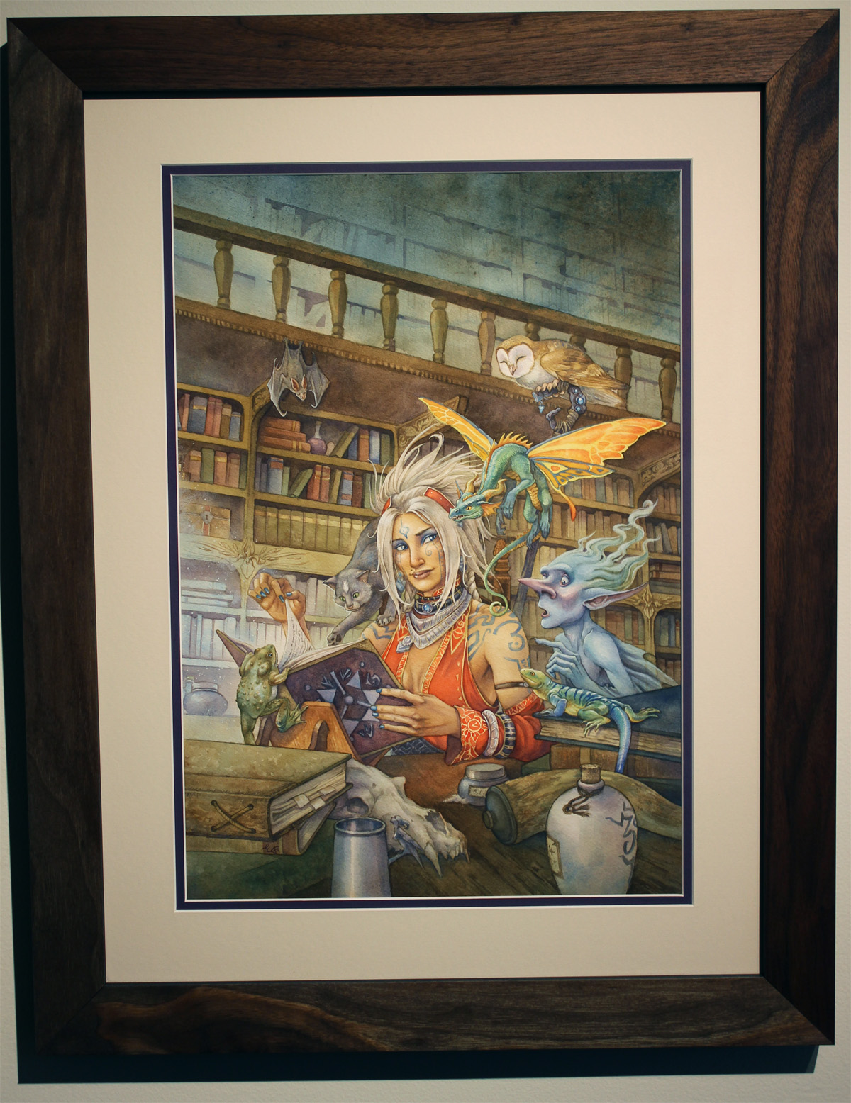
Emily Fiegenschuh is a highly talented, widely published artist and illustrator working predominantly in watercolor and gouache on paper. One of Emily's original paintings for a book cover recently sold at GenCon '15 and she brought the work to us for conservation framing. The painting is a vivid interior of a library with a great cast of characters rendered with layers of gouache and a receding background in washes of watercolor. The result is a luminescent painting that could be framed a variety of ways: refined gold or silver moldings, bright and playful, or natural, almost anything would be complimentary to Emily's painting. ad intra
We chose an Urban Ashes solid Walnut frame with medium figure, a double mat, and conservation acrylic glazing - as it was set to be shipped from Mainframe to the client. The molding was spot on with a beautiful oiled finish enhancing the tones of the painting while helping to create play between the interior and exterior space of the painting. Often times I steer away from double mats when the active colors are bright and potentially compete with one another, but Emily found a new Crescent Alpha mat in a plum tint which accented the woman's eyeliner, jewelry and book perfectly, steering the presentation away from too formal.
We couldn't be more pleased with the results. A natural frame that brings does more than harmonize and compliment tones, but adds movement between an imagined and a physical interior. This idea of movement has a lot to do with the grain or more accurately the figure of the wood itself. Special thanks to everyone at Urban Ashes for their collaborative efforts in making this custom molding better than we could have imagined. For all custom framing inquiries just drop us a line here.